Posts

Portfolio

Image
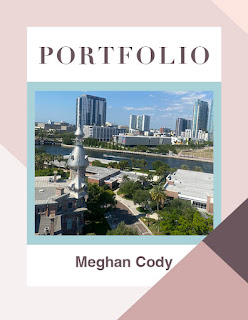
  Template: From AdobeStock b y  TypoEdition  I created this portfolio using Adobe InDesign. This portfolio is a culmination of all of my assignments this semester in FMX 210. I included my work from Adobe Illustrator, Adobe Photoshop and Adobe InDesign.   I chose a color palette of shades of pinks and purples to make it look fun. I used Helvetica font for my body paragraphs and Diot font for my headers. I feel as though this project is a great representation of my work throughout this course and shows the progression of my skills.

Business Cards

Image
Sketches: Final Business Cards: I created these business cards using Adobe InDesign. I first sketched some designs using a pencil and paper. I then referenced those sketches when I went to make my final designs. I made three different business card designs using three different color palettes. I incorporated the logo that I designed in Adobe Illustrator and I am very happy with the way they turned out. I definitely feel more confident in my ability to use Adobe InDesign for page layouts.

Postcard

Image
  I created this postcard using Adobe Photoshop and InDesign. I made the background image for the front of the postcard using Photoshop by finding a free image from unspalsh of the solar eclipse and making the background black. Next, I placed that image into my InDesign file on page 1. I then used the text tool to type the words "Austin", "Texas", and "Total Solar Eclipse" since Austin Texas was one of the few locations where you could actually see the total solar eclipse this year. On the back I used a picture of the city of Austin, TX with a white box in the center for people to write their messages. I also imported my tagbrush from Photoshop and used it as the stamp for my postcard.

InDesign Tutorials

Image
Video #1: This video discussed how to use the page tool on Adobe InDesign. This tool seems fairly simple to use and the narrator did a great job at describing its uses in great detail. This seems like a tool that would have to be used in any InDesign project as it lays the foundation for your work. Video #2: In this tutorial, the narrator discussed how to use the type tool and the type on path tool in Adobe InDesign. I found it helpful that he showed the ways through which the type tool on InDesign differed from the type tool on the other two Adobe softwares that we have used so far. I feel like this tool may become a bit challenging because I might forget that this type tool doesn’t function exactly how it did on the other two softwares. Video #3: This tutorial covered different ways you can use the rectangle frame tool to design your page layouts in Adobe InDesign. Of the three tools that I looked into, this one appears to be the most difficult because there are so many different use...

Animation

Image
Animated GIF Original Photos: Animated GIF: I made this short animation using Adobe Photoshop. This was a frame by frame animated gif and ended up being about 30 seconds long. I decided to animate a bee spelling out "bee happy." First, I created a storyboard through which I mapped out my vision for the gif. Next, I searched for images on free image websites and added them to my photoshop workspace. Using the images I found online, I was able to execute my storyline. As a final touch, I placed my tagbrush on the beehive after the bee flew into it at the end.

Animation Tutorials

Image
 Video 1: From this video, it seems like it is pretty simple to create new frames and groups in Photoshop. Frames are used to show movement in the animation. You adjust the images slightly between frames so when you watch the animation, it appears as though it is a fluid movement. I found this video interesting because the example he used of the person walking was easy to follow along with and didn’t overcomplicate the process for beginners.  Video 2: I really liked how quick and straight to the point this tutorial is. The narrator was able to cover how to use a wide variety of tools in such a short amount of time. I found it interesting how he duplicated the groups in the layers panel in order to create movement in the animation. Video 3: This tutorial covered how to create new frames and groups. He used the brush tool to create his animation. He sketched a name in multiple frames, making them all slightly different so when you watch the animation it looks like it’s moving. H...

Somewhere

Image
 Original Image of Scene from Modern Family: Original Image of me: Final Image: I used Photoshop to insert myself into a scene from the popular television show, Modern Family. I chose to place myself into this scene because I found it to be a very lighthearted and fun moment in the show and one that I felt I would enjoy being a part of. The family is supposed to be composed and taking a photo together, but instead it turns into a playful fight where they are all throwing mud at each other. I used the quick selection tool to cut my body out of the original image and then I created a mask. I also adjusted the hue and saturation of the image to make myself appear as though I belong in the photo. To complete the assignment I added my tagbrush to my right pant leg so it would appear as though it was dirt and blend into the image.

Photoshop Activity

Image
 Image I think would be difficult to Photoshop myself into: I feel like this image would be difficult to Photoshop a picture of me into because it would challenging to make myself look like I am actually part of the crowd of people. I also feel like it’s his outfit that makes him look as though he actually belongs at the event in this image and that would be a challenge to recreate. It’s impressive how his body is positioned in a way that makes him blend into the crowd while also executing the outfit and the action of putting the skates on to really make the scene look believable. Image that inspired me: This image inspired me for my Somewhere project because I too will be placing a photo of myself into a group picture and this gave me some ideas on how I can make it look natural. I feel like it can be challenging to place yourself into a group picture and still make it appear as though you are actually part of the group. Set of images that made me laugh: This set of images made me...

BW to Color

Image
 Original Photo: Split Complementary: Analogous: Triad: I created these three versions of my original photo using Adobe Photoshop. I first placed my photo into photoshop and converted it into greyscale. From there, I went to colors.adobe.com to choose three different color palettes. The three that I choose were split complementary, analogous, and triad. I used the different color palettes to add pops of color into my black and white photo. To do this I used the quick selection tool to outline specific areas of the image, then created a new layer with a mask. After that, I pulled the color I wanted from the color palette and filled the desired area with that color. I am happy with the way these turned out and feel like this activity helped strengthen my skills using different layers in photoshop and creating masks.

Documentary

Image
 Documentary: The Art of Design  This image from “The People’s Portfolio” really stood out to me. The photo depicts a young girl wearing a shirt that reads “free my dad.” This photograph made me feel sad for the child and I can’t imagine what it would be like to go through something like that. The image is representative of the many children who are separated from their parents as a result of U.S. immigration laws.  The process of immigration enforcement, particularly at the U.S.-Mexico border, has led to countless families experiencing traumatic separations. Such actions have sparked widespread outrage and condemnation, as they inflict significant emotional and psychological harm on children, leaving them vulnerable and traumatized. I feel like this image, along with the other photographs in that file portrayed the effects of U.S. immigration on families well and accurately.  As was stated in the documentary, connection is a huge part of photography. In this picture...

Tag Brush

Image
For this activity I used Photoshop to create a tag brush for my logo. I had previously created my logo of a jellyfish using Adobe Illustrator. I used that same logo and placed it into Photoshop to make my tag brush. I used the pen tool to form an outline around my logo then I added scratches and a negative overlay to make the logo look textured. I am happy with the final look of the tag brush and look forward to using these skills in my future photoshop projects.    

Photoshop Tutorials

Image
  Crop Tool Tutorial: This video explains how to use the crop tool in Adobe Photoshop as a beginner. The narrator thoroughly explains how to crop and straighten images. This video is very easy for a person who has never used Photoshop before. The narrator shows how to find the tool in the toolbar and explains the keyboard shortcut to accessing it. Based on this tutorial, I think the crop tool would be relatively easy to use. I found it particularly useful when the narrator gave a brief summary of everything he covered in the video at the very end to help me remember. This was an in-depth tutorial covering how to use the brush tool in Photoshop. I liked how the narrator put a table of contents at the beginning of the video to give people the option to skip to the parts of the video they would like to cover. Based on this tutorial, I feel like the brush tool is one of the more complex tools on Photoshop. There are so many different ways to use the brush tool and I think it might be h...

Propaganda Poster

Image
Original Image: Self-Portrait: Propaganda Poster: I created this propaganda poster to address the serious issue of domestic violence in our society. Domestic violence affects an estimated 10 million people in the United States every year and most of these cases go unreported. I decided to keep the poster simple to really emphasize the message. I used the words "Love Shouldn't Hurt" at the top of the poster to bring awareness to domestic violence and the words, "Break the Silence" to touch upon the fact that a lot of incidents involving domestic violence are not talked about. I placed a broken heart behind my self-portrait and a teardrop on my cheek to add a visual element to the poster.

Logo

Image
Sketches: Black & White Version: Color Versions:               I created this logo as a combination of a jellyfish and a sun to represent the tranquil and vibrant energy I feel like I carry myself with. I originally sketched images of the sun and jellyfish separately, but together, I feel like they embody two important parts of who I am. I created these images using Adobe Illustrator. I started by placing my sketches of each of the images in my art board. I then used the pen tool to trace the outline of the jellyfish with part of the sun inside. Next, I adjusted my shapes until they were exactly as I had envisioned them. Finally, I played around with different color combinations until I found some that I felt best represented the deeper meaning of my logo. The blue symbolizes calmness and tranquility and the pink and orange represent my outgoing and optimistic side. The final product of this logo is reflective of me as a person.