Posts

Portfolio

Image
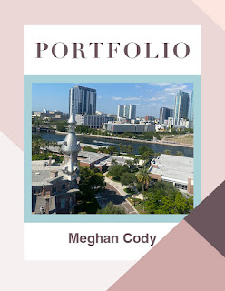
  Template: From AdobeStock b y  TypoEdition  I created this portfolio using Adobe InDesign. This portfolio is a culmination of all of my assignments this semester in FMX 210. I included my work from Adobe Illustrator, Adobe Photoshop and Adobe InDesign.   I chose a color palette of shades of pinks and purples to make it look fun. I used Helvetica font for my body paragraphs and Diot font for my headers. I feel as though this project is a great representation of my work throughout this course and shows the progression of my skills.

Business Cards

Image
Sketches: Final Business Cards: I created these business cards using Adobe InDesign. I first sketched some designs using a pencil and paper. I then referenced those sketches when I went to make my final designs. I made three different business card designs using three different color palettes. I incorporated the logo that I designed in Adobe Illustrator and I am very happy with the way they turned out. I definitely feel more confident in my ability to use Adobe InDesign for page layouts.

Postcard

Image
  I created this postcard using Adobe Photoshop and InDesign. I made the background image for the front of the postcard using Photoshop by finding a free image from unspalsh of the solar eclipse and making the background black. Next, I placed that image into my InDesign file on page 1. I then used the text tool to type the words "Austin", "Texas", and "Total Solar Eclipse" since Austin Texas was one of the few locations where you could actually see the total solar eclipse this year. On the back I used a picture of the city of Austin, TX with a white box in the center for people to write their messages. I also imported my tagbrush from Photoshop and used it as the stamp for my postcard.

InDesign Tutorials

Image
Video #1: This video discussed how to use the page tool on Adobe InDesign. This tool seems fairly simple to use and the narrator did a great job at describing its uses in great detail. This seems like a tool that would have to be used in any InDesign project as it lays the foundation for your work. Video #2: In this tutorial, the narrator discussed how to use the type tool and the type on path tool in Adobe InDesign. I found it helpful that he showed the ways through which the type tool on InDesign differed from the type tool on the other two Adobe softwares that we have used so far. I feel like this tool may become a bit challenging because I might forget that this type tool doesn’t function exactly how it did on the other two softwares. Video #3: This tutorial covered different ways you can use the rectangle frame tool to design your page layouts in Adobe InDesign. Of the three tools that I looked into, this one appears to be the most difficult because there are so many different use

Animation

Image
Animated GIF Original Photos: Animated GIF: I made this short animation using Adobe Photoshop. This was a frame by frame animated gif and ended up being about 30 seconds long. I decided to animate a bee spelling out "bee happy." First, I created a storyboard through which I mapped out my vision for the gif. Next, I searched for images on free image websites and added them to my photoshop workspace. Using the images I found online, I was able to execute my storyline. As a final touch, I placed my tagbrush on the beehive after the bee flew into it at the end.

Animation Tutorials

Image
 Video 1: From this video, it seems like it is pretty simple to create new frames and groups in Photoshop. Frames are used to show movement in the animation. You adjust the images slightly between frames so when you watch the animation, it appears as though it is a fluid movement. I found this video interesting because the example he used of the person walking was easy to follow along with and didn’t overcomplicate the process for beginners.  Video 2: I really liked how quick and straight to the point this tutorial is. The narrator was able to cover how to use a wide variety of tools in such a short amount of time. I found it interesting how he duplicated the groups in the layers panel in order to create movement in the animation. Video 3: This tutorial covered how to create new frames and groups. He used the brush tool to create his animation. He sketched a name in multiple frames, making them all slightly different so when you watch the animation it looks like it’s moving. He also di

Somewhere

Image
 Original Image of Scene from Modern Family: Original Image of me: Final Image: I used Photoshop to insert myself into a scene from the popular television show, Modern Family. I chose to place myself into this scene because I found it to be a very lighthearted and fun moment in the show and one that I felt I would enjoy being a part of. The family is supposed to be composed and taking a photo together, but instead it turns into a playful fight where they are all throwing mud at each other. I used the quick selection tool to cut my body out of the original image and then I created a mask. I also adjusted the hue and saturation of the image to make myself appear as though I belong in the photo. To complete the assignment I added my tagbrush to my right pant leg so it would appear as though it was dirt and blend into the image.